Project Overview
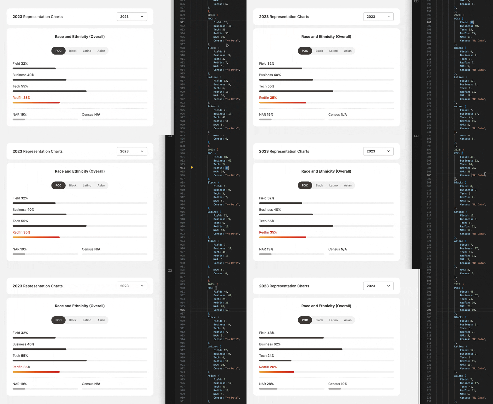
Redesigned Redfin’s diversity reporting from static data tables to interactive bar charts with filtering capabilities. The goal was to enhance usability, accessibility, and scalability, while presenting data in a way that is easy to digest and interpret.
ROLE
UI/UX Designer, Interaction Designer, Data Visualization Specialist, and Front-End Developer
TIME
2 Weeks
KEY CONTRIBUTION
Redesigned Redfin’s diversity reporting by transforming static data tables into interactive, user-friendly bar charts with filtering capabilities, built from scratch using HTML, CSS, and JavaScript.
IMPACT
The redesign not only improved the user experience but also showcased Redfin's commitment to transparency and inclusivity. By offering a simplified, interactive interface, the modernized presentation enabled users to more easily understand the company's progress in fostering a diverse and equitable workplace.
Interactivity for Better Usability
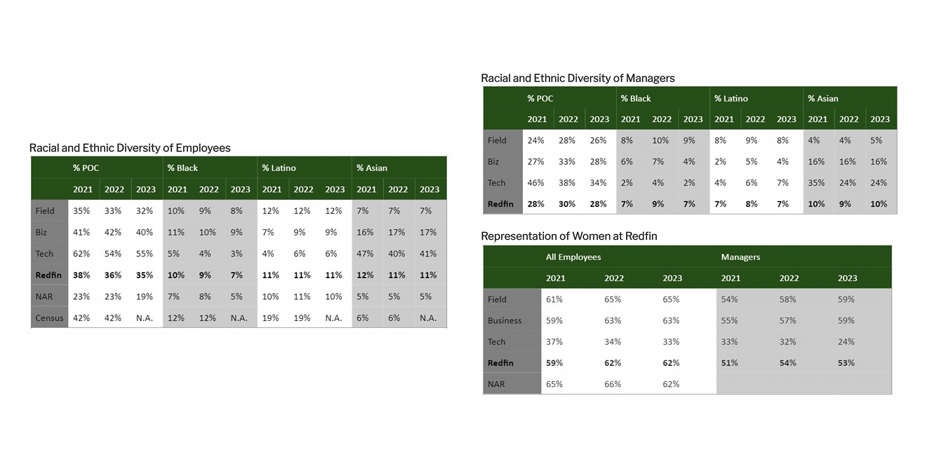
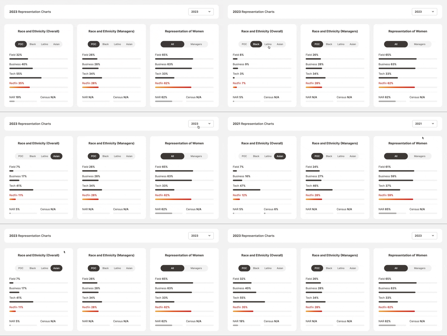
Introduced filterable, interactive bar charts, empowering users to explore the data they care about instead of being forced to parse through a large, static table.
-
Before
-
After
Simplified User Experience
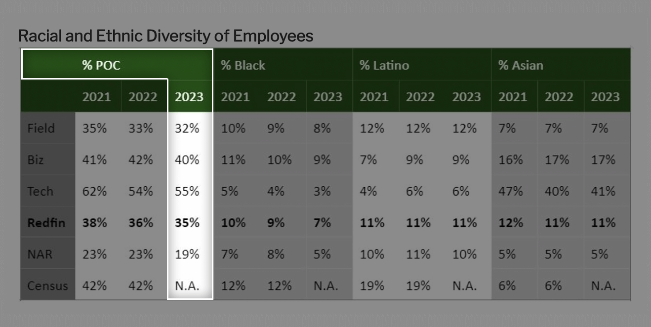
Reduced cognitive overload by presenting data in a clear, digestible format. Users can focus on key metrics while retaining access to the broader context of diversity data.
-
Before
-
After

Responsive Design
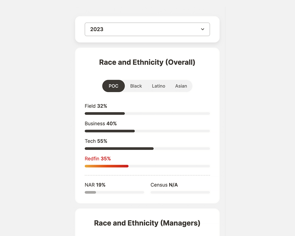
The original design relied on fixed images that shrank on smaller screens, making it hard to read and interact with data. The new responsive design uses adaptable charts instead of images, ensuring seamless access to data across all devices without losing clarity.
-
Before

-
After
Enhanced Accessibility
The original design, based on images, is not screen reader-friendly due to the lack of alternative text. The second design, using code, ensures accessibility by following WCAG 2.1 standards, adding ARIA labels, and using semantic HTML, allowing screen readers and assistive technologies to interpret the content. This provides a more inclusive experience for people with disabilities.
-
Before

-
After

Scalable and Maintainable
A flexible structure allows quick updates and easy data additions without redesigning. By generating charts through code, real-time data integration is simplified, unlike the original method of using static images. This approach ensures scalability and easy maintenance as data grows or requirements change.


