Making learning fun and memorable
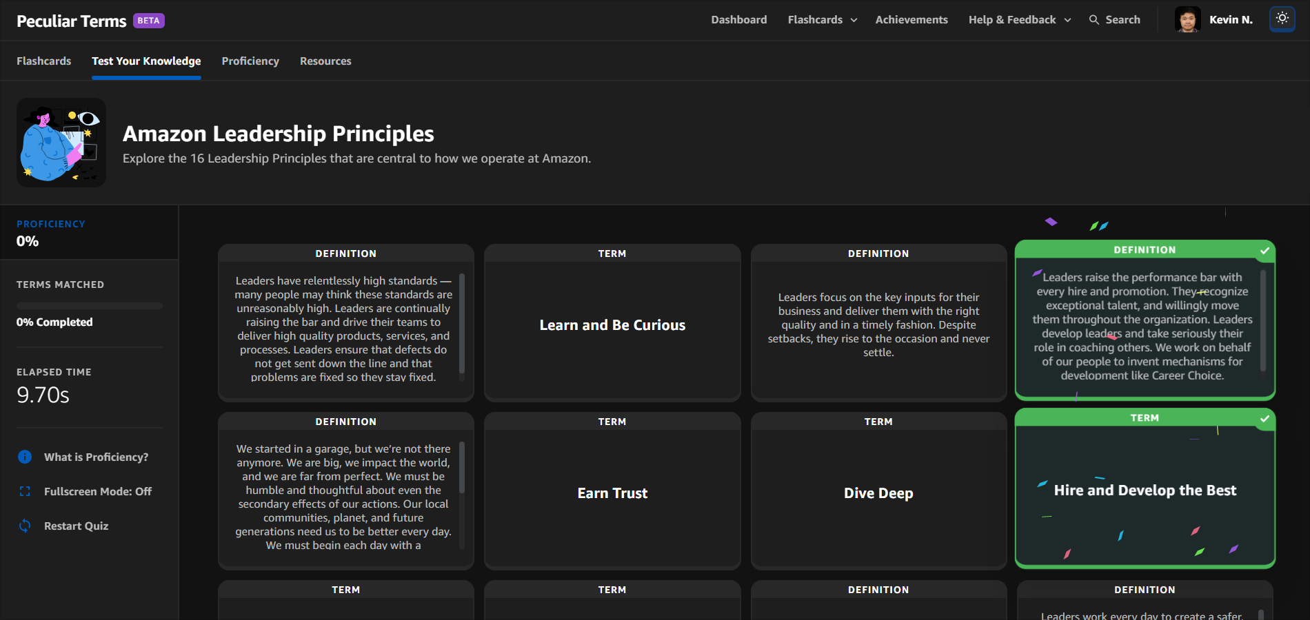
Amazon's unique language can be an initial challenge to grasp and understand. With Peculiar Terms, new employees will learn the unique phrases and terms of Amazon by getting involved in this new game. The game is designed to help new Amazonians feel knowledgeable, integrated, and engaged throughout their onboarding experience. Everyone, regardless of start date will have access to enjoy interactive matching games to practice their recollection of the information.
Project Overview
This project presented the opportunity to address a critical challenge faced by new hires: feeling disconnected and overwhelmed by a company’s vast, unfamiliar terminology. At Amazon, with over 6,000 unique terms, new employees often struggle to belong, unable to speak the same language as their colleagues. To simplify this experience, we created a lightweight, web-based gamified flashcard application that not only makes learning easier but also fosters a sense of inclusion, helping new hires gain confidence, feel supported, and integrate seamlessly into Amazon’s culture.
ROLE
UI, UX, Instructional Designer, and Front-End Developer
TIME
3 Months
TECHNICAL SKILLS
React, HTML, CSS, JavaScript, API Integration with Backend Services, AWS (S3, DynamoDB, CloudFront, CI/CD Pipelines, IAM, Lambda, CloudWatch)
TOOLS
Photoshop, Visual Studio Code, Cloud Virtual Desktop, NVDA Screen Reader
My Process
Empathize
Problem Statement
Our organization is expected to grow 48%, and almost 50% of our population are expected to start virtually by the end of 2021. Amazon’s cryptic acronyms and cultural concepts used for key processes can be distressing for new hires to decode, causing them to feel like an outsider. In addition, according to research by Gartner, only 32% of employees hired in the past 12 months feel a sense of belonging to their organization. Understanding Amazon-specific vernacular will help new hires feel like they’re speaking the same language as their colleagues. As a result, new hires will feel more informed, included, and engaged throughout their onboarding experience.
User Interviews
In order to learn about the real experiences people have had throughout their onboarding experience, we recruited 12 new hires for user interviews. Here, we focused on asking open-ended questions to learn as much as possible about how our users leverage learning resources to navigate their onboarding experience.
Some questions asked during the interview:
Did you feel a sense of belonging and that you and your unique contributions were valued?
What was most helpful to you during your onboarding?
What were your main challenges or pain points?
Describe your most significant learning experience(s) during your onboarding experience.
Did you encounter any challenges with feeling included or welcomed on your team?
Tell me about your most recent experience with online learning resources.
After conducting these user interviews with the new hires, I wanted to take all this new information and create themes to better understand our users.
Empathy Map
I will leverage an empathy map to help us summarize our users’ sentiment towards the new hire onboarding experience. I started by categorizing the information into four categories (Say, Do, Think, and Feel) to get a comprehensive understanding of everything learned during the user interviews.
User Persona
To make sure that my decisions moving forward in the process are user-centered, I wanted to have a clear understanding of who Peculiar Terms’ users are. Using the learnings from my empathy map, I created a user persona to represent who I would be creating the product for - Meet Olivia!
Define & Ideate
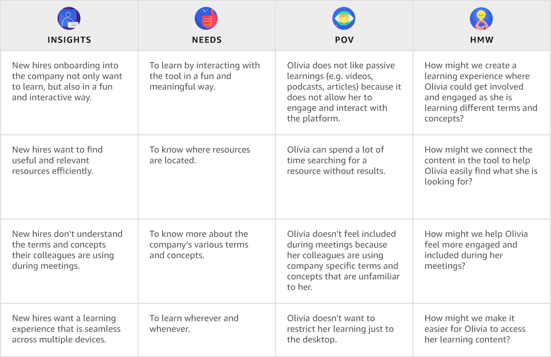
Now that we identified our target user, Olivia, it was time to identify the problems we are solving for based on what we have learned about our user. To help define these problems, I used the insights gained from user interviews to create POV Statements to frame the problem from the user’s perspective. I used these POV statements to identify “How Might We” questions which would help brainstorm creative solutions while keeping us focused on the right problems to solve.
Brainstorming
Now that I knew what problems we needed to solve for Olivia, I started my brainstorming process to come up with potential solutions. I used the HMW questions that I identified to frame the brainstorming process so that I could focus on problems that will generate value to the user. Refer below for an example.
Prototype
Site Map
To help organize and clarify the content that needs to be on our site, as well as help eliminate unnecessary pages. I created a site map to help organize the structure and content on our website in a way that would be logical and easy to navigate for our user.
Initial Mockups
I leveraged low-fidelity mockups early within the design phase to translate high-level design concepts and requirements into tangible artifacts that can be rapidly iterated. I can worry less about the more technical parts of prototyping and spend more energy on ideation. As a result, this allows for real-time iteration - I can quickly redo parts of the design based on customer/stakeholder feedback in real time, in just a few minutes.
Early-Stage User Testing & Refinement
A more connected search function
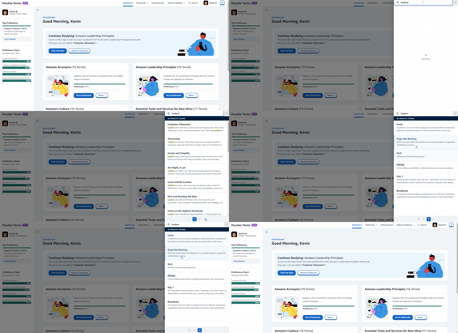
The original search feature was simply a repository of terms and concepts. Users wanted to be able to (1) easily know which result included their input and (2) the option to learn more about the results. To help users better navigate the platform, I modified the design to (1) highlight words that matched the user’s input and (2) the option to click on results to learn more and navigate directly to the flashcard deck.
Develop
Although this was a great idea, we had limited resources and was not able to hire a technical team to build the tool. Therefore, I transitioned from designer to Front-End Developer and became responsible for front end web development (React, HTML, CSS, JavaScript) and API integration (partnered with an SDE). I considered accessibility and all edge cases, like error responses, and performance considerations both from the perspective of UI and backend.
I leveraged Atomic Design principles to develop the web application. This understanding of how smaller elements, or atoms, can be combined together to create larger objects, or molecules, parallels well with the design world, and the many elements we use to construct our designs. Following the atomic design principles provides us a structure for not only formulating our design, but creates the building blocks for constructing our design systems and pattern libraries.
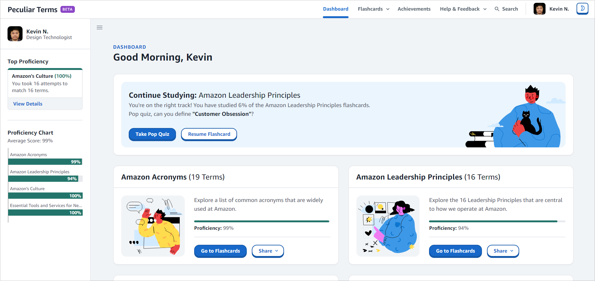
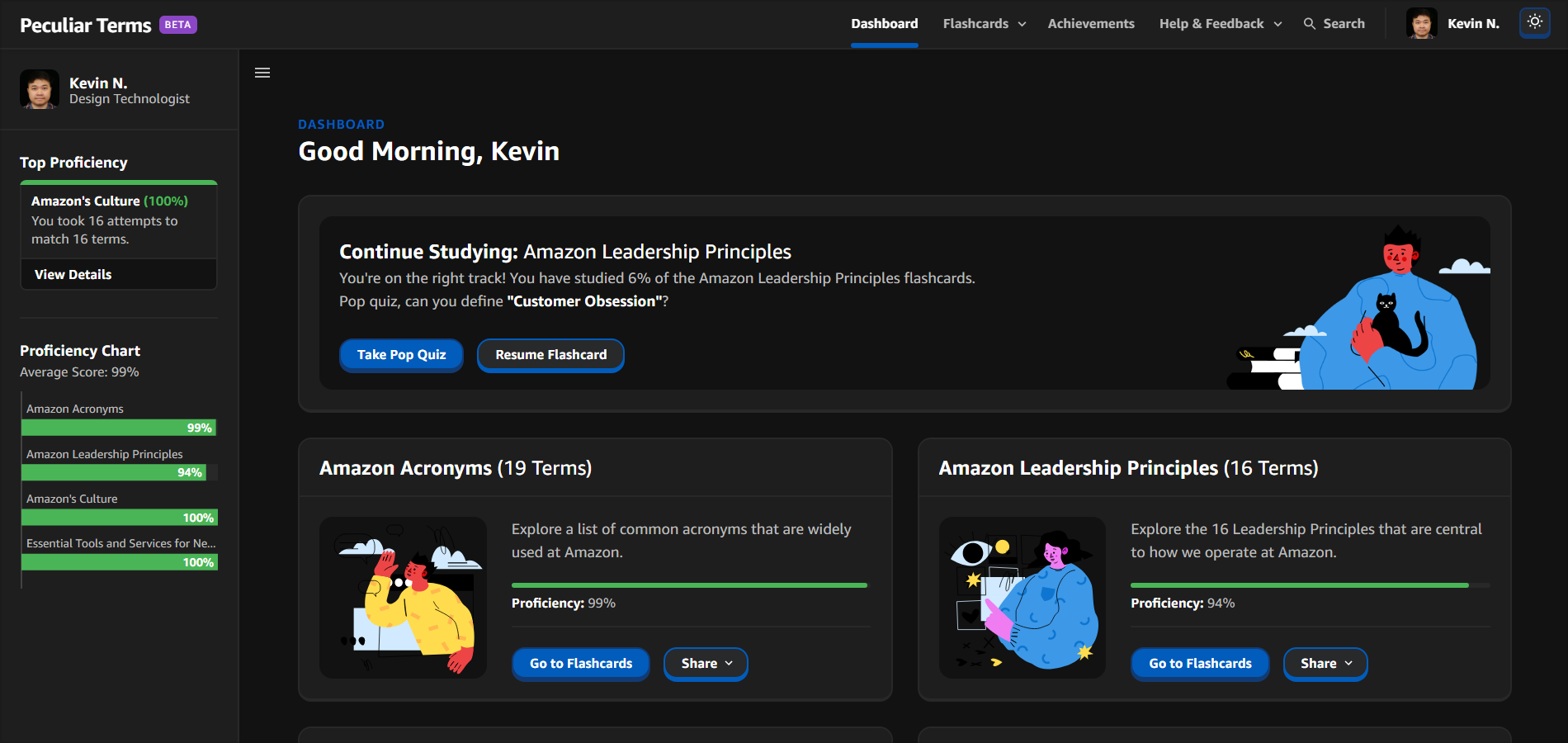
As a result, I built 60 React components (independent and reusable bits of code) to assemble the web application. Below is the final product.
Accessibility
For many, technology built with accessibility in mind makes things easier. For people with disabilities, technology makes things possible. To ensure that our tool was usable and understandable for the majority of people with or without disabilities, I ensured that the web components were Web Content Accessibility Guidelines (WCAG) 2.0 Level AA compliant. In addition, I used the NVDA (NonVisual Desktop Access) screen reader to manually test the website to ensure that it could be navigated for people with visual and/or motor impairments. Refer below for an example.
Soft Launch: Usability Testing & Iterations
This is an iterative process that requires going back to the prototyping phase if any of the following steps fail to achieve signoff.
Review with PMs to see if it matches requirements.
Review with stakeholders/customers.
Show to users (user testing) – looking for friction, things they like, things they don’t like, new ideas. Set environment for the users to propose new innovative ideas.
Our testing included ~2,000 employees (mix of new hires and tenured employees) and collected feedback via (1) surveys (2) issue manager for technical bugs and (3) feature requests. We concluded the user testing group with small focus groups to gain more insight into any potential issues and concerns about the features of the tool.
All 16 technical issues were resolved before deployment. The common theme around the feature requests and survey feedback was regarding improvements to the matching game.
Selection Reminder
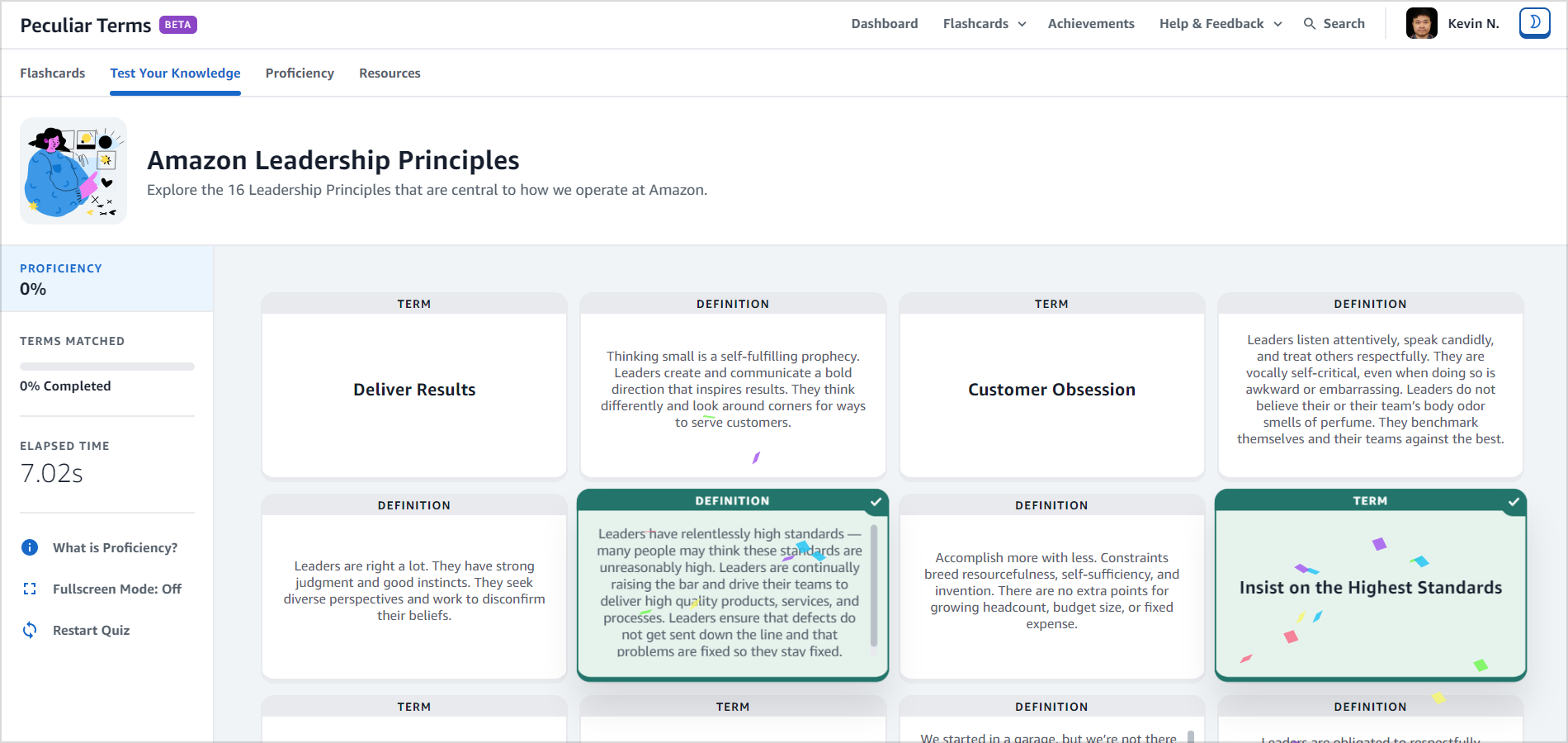
Since some flashcard decks will have a lot of terms and definitions, users often times scrolled down to find correct matches. As a result, users would sometimes forget what they previously selected – causing them to (1) scroll back up or (2) select the wrong card. To make this easier for our users, I added a fixed component to the bottom of the page that would remind users of what they selected. As a result, users will never feel stuck or confused and always know what to do next (e.g. What is the definition of X).
Game Settings
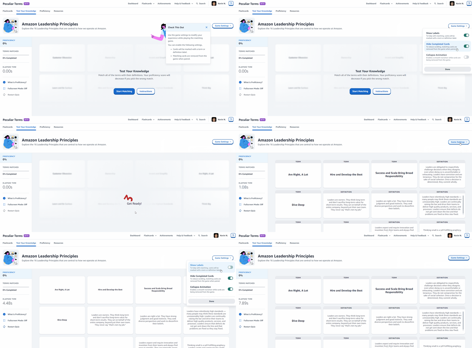
Users wanted to customize the matching game to fit their preferences. As a result, the design was modified to include the top 3 (based on survey data/requests) game settings: (1) cards will be marked with a term or definition label, (2) matching cards are removed from the game when paired and (3) enable a smooth transition when cards are being removed from the game.
Deployment
I presented the user feedback from our testing and a demo of the final product to stakeholders (over 100+) and leadership team to obtain additional feedback and signoff for launch. The feedback from the meeting was overwhelmingly positive and did not surface any critical feedback that would prevent us from launching. On August 30, 2021, we launched the tool company-wide and the feedback has been extraordinary – refer to the next section for more information.
Recognition and Scale
The success of Peculiar Terms was recognized internally at Amazon, earning a feature on the company's internal blog, highlighting its impact in helping new hires navigate Amazon's unique culture. Due to its initial overwhelming positive reception—garnering a 97% satisfaction rate from over 5,000 users—the game was officially integrated into Amazon’s onboarding plan, scaling its reach across the company.
Reflection and Next Steps
Reflection
I explored a new approach for this project by testing my front-end development skills and various design techniques to help gain exposure to the entire end-to-end product design process. I think this method was really effective in quickly developing a delightful product for our end users because it created a seamless handoff from design to development.
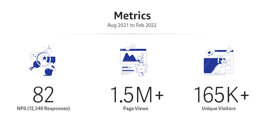
We conducted a soft launch in May 2021, attracting 2,000 unique visitors and generating 12,000 page views. User feedback from surveys was overwhelmingly positive, reinforcing the success of our initial rollout. As a result, on August 30, 2021, we launched a new internal platform designed to make learning terms and concepts both engaging and memorable. In just six months, we successfully scaled the platform across Amazon, attracting over 165,000 users, generating 1.5 million page views, and achieving an impressive NPS of 82.
Next Steps
With the timeline of this project, I could only focus on the top prioritized features to meet our project goals and deliver maximize value to our users. Since launch, we have received over 40+ feature requests from users. There’s a lot of room to add more value and delight to the experience as we continue to inspect user feedback and determine additional features to implement.


